FinTech
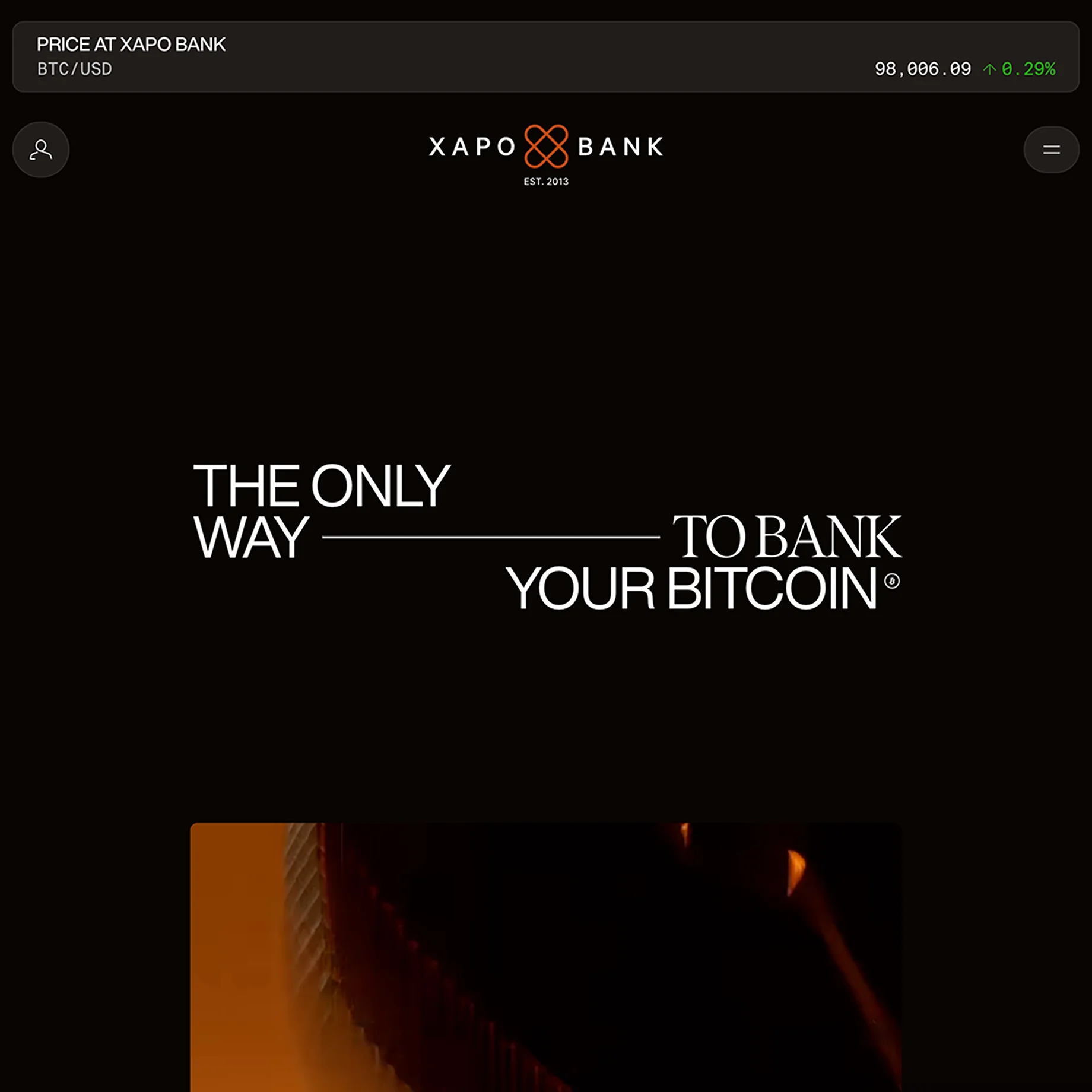
Xapo Bank's site looks standard at first, but one interactive UI block in the middle makes it worth a closer look.
Why it's here
Almost ignored this website, but in the middle there is cool UI block
I added Xapo Bank first of all because it stood out from everything else. It was my dark-websites period, and its thin orange branding running through the photos made me want to save it. Since then they've cut the interesting blocks with animated UI. Instead there's more content, possibly with AI imagery, though it's hard to tell; it looks more like real photography.
It looks like a big company's site. You can borrow from it, but if you're a team of one, it will take you a very long time, because elements like these need hours of polishing. That's what designers are for: making a big corporation with lots of content feel premium is hard. You need to tell the truth and have a real foundation behind it. It's a design problem nobody talks about.