Published date:
October 31, 2026
I've been collecting inspiring websites for over a year and saving many of them as PDF snapshots. When I came back to all 54 in October 2026, the surprise wasn't that they got simpler: websites have been moving towards pragmatism for a decade. The surprise was the speed. In one year, more sites aged than I'd normally see in several, and the ones that leaned on AI-generated visuals aged first.
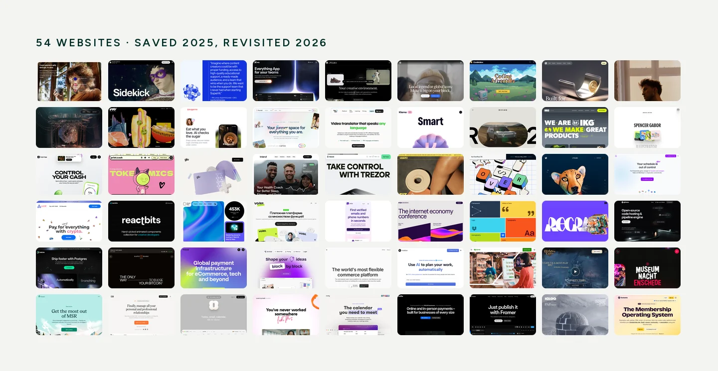
I started the list as a folder of sites I wanted to visit again and again. I photographed them because I knew they would change. Over time it turned into an analytical tool: a way to see how real companies treat their websites over time. I came back to it while working on my own site.
I saved most sites as full-page PDF snapshots with a script an early AI model wrote for me. I lost that script, so the newest sites have no PDF yet, and rebuilding it is on my list, because without snapshots you can't really see what changed.
By simplification I mean one thing: removing complex visual elements. If a team added a strong AI-made element, I don't count that as simplification. That's enrichment. Each site landed in one of five groups: simplified, unchanged, improved, gone or renamed, or too new to compare.
Of the 54 sites, 14 were added too recently to compare, and one I couldn't check. Of the 39 I could compare, 17 stayed the same, 11 got simpler, 8 improved, and 3 are gone or renamed. Simplification wasn't the majority. The bigger surprise is that many sites that didn't change at all still look a year older. The market around them moved, mostly because of AI.
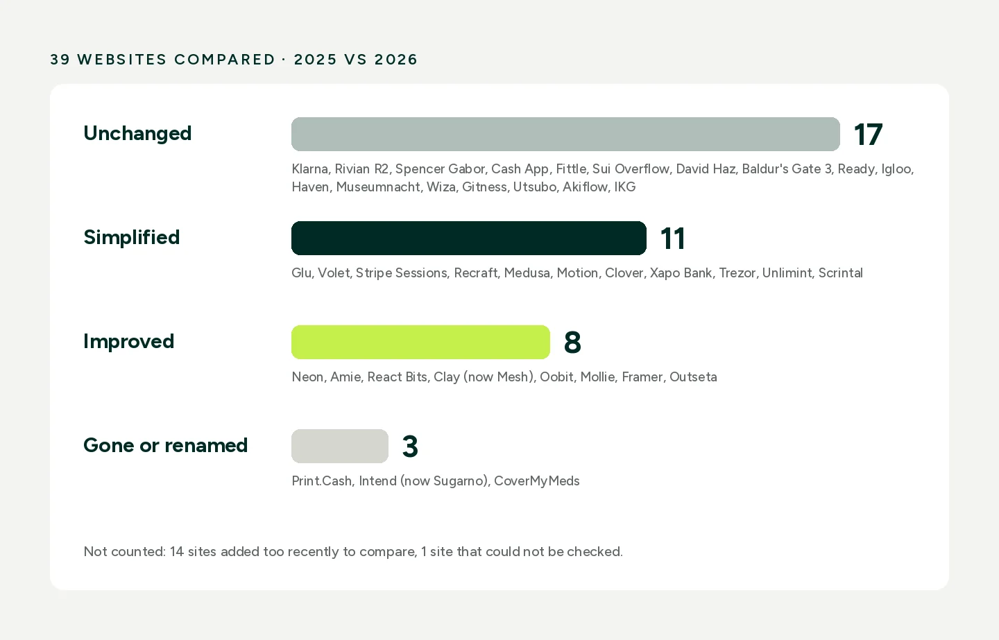
The least surprising part: many SaaS projects moved to pragmatism. When you launch, you want to impress. When you actually have to build and grow the site, you don't have enough hands, and nobody on the team can draw graphics that complex.
In my experience, two things trigger it. Either the product team changes, or the company gets enough money and users that marketing moves its effort elsewhere, sometimes into the physical space. Optimisation plays a part, but it isn't the main reason: most of these sites were already well optimised.
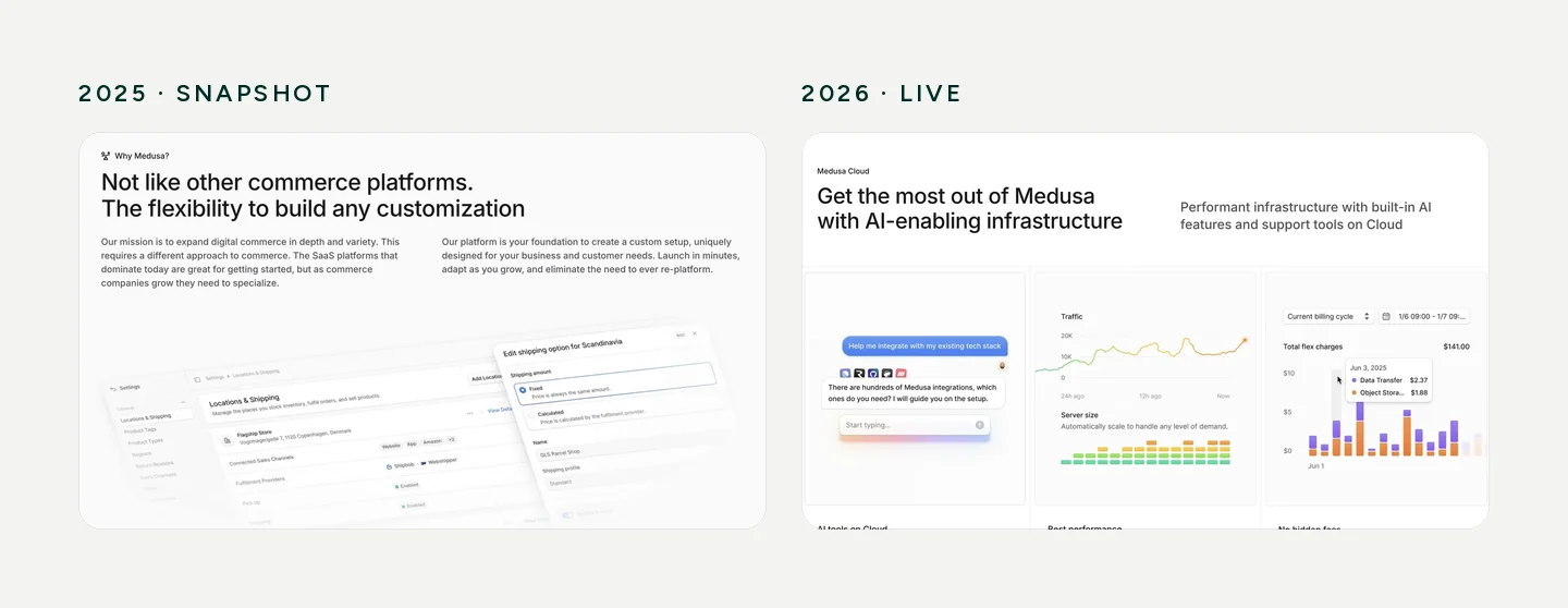
3D, illustrations and big full-screen animations go first. The reason is simple. A new product appears and needs a new visual, and there's nobody to make it. One person was paid a lot to create the original, and no one else can repeat it.
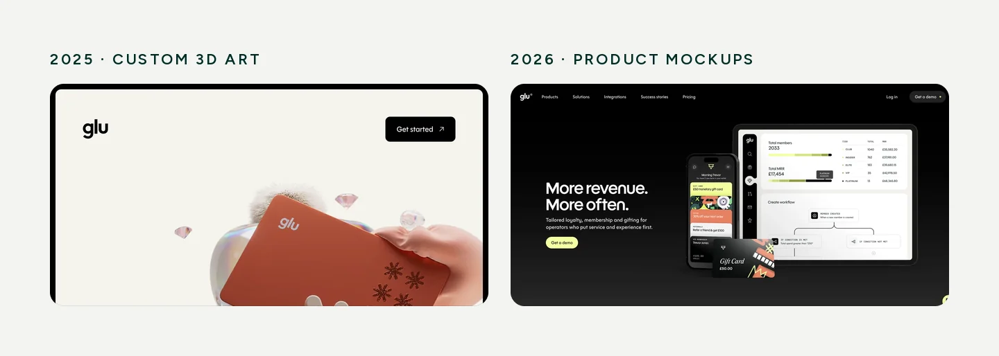
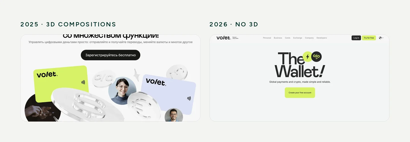
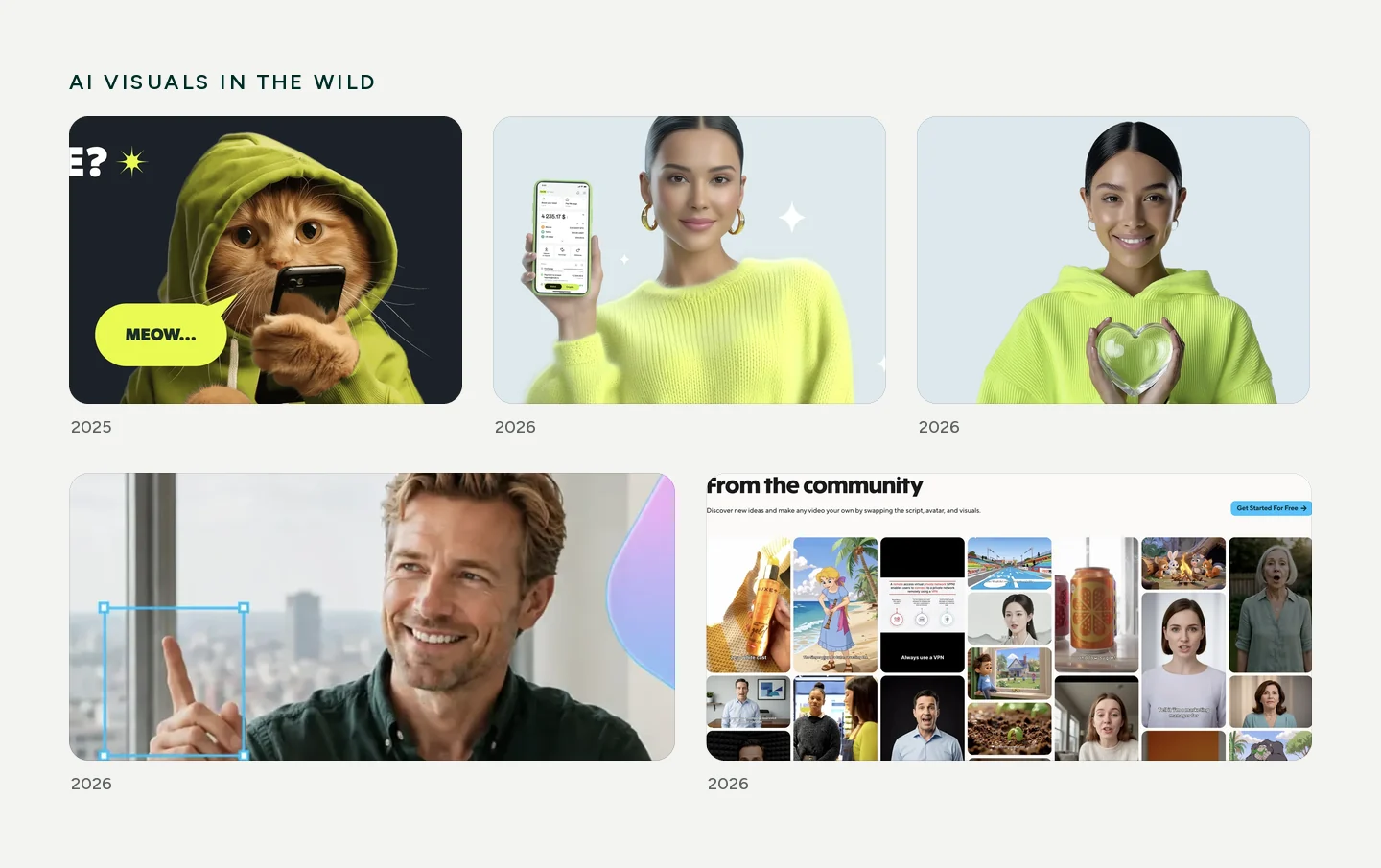
The companies that were first to put AI imagery on their sites made them look cheaper. AI moves so fast that its styles age month by month. Anything generated that appears at three, four or five big companies ages instantly, and filters on top don't help. The teams that added the most generated graphics aged first, because unique AI 3D barely exists, and making raster 3D look unnoticeable is something only a handful of people can do.
AI works well where you can't tell it's there. UI animations built into the site are a good example. You can still spot AI immediately in drawn people and in 3D, but UI elements it makes well. Most of the strong sites in my list don't look AI-made at all. They probably used it in the process, not on the surface.

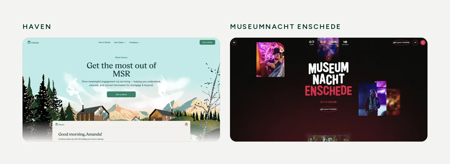
Simplification makes a site better when there's a brand, a consistent style and one strong element to hold everything together. If you have a huge user base, you can simplify however you like and build pages at scale. That's fine too. Today content matters more than ever and deserves more time than before. And content isn't only text: it's also the structure and architecture of the site.
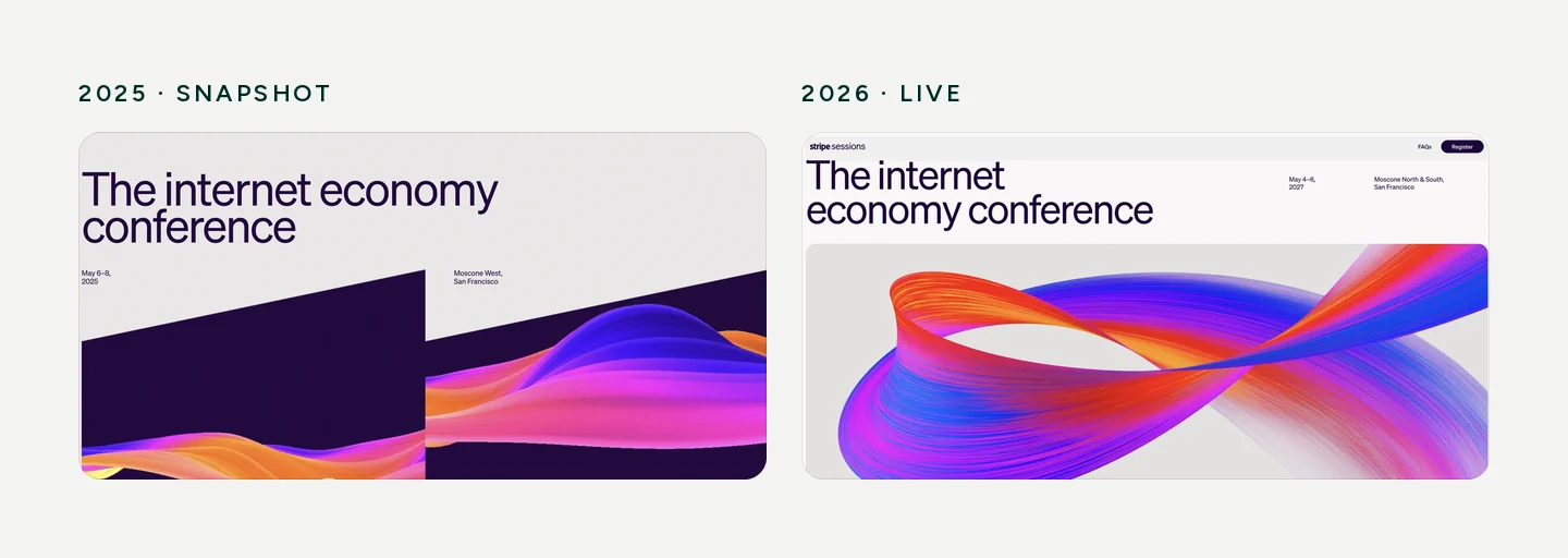
Bad simplification is when there's no direction. Buttons get bigger, elements float, the style is smeared across the site, a random gradient here, something creative there. It looks like a junior made it. Look at premium luxury brands: their style is always very simple and very hard to copy, because many people stand behind it, photographers and designers who spend a week on a single corner radius. When a junior thinks they can do the same, they usually get 10% of it. One payment platform in my list shows this well: its blocks stayed strong because they're easy to repeat, while the graphics started to vary from page to page.
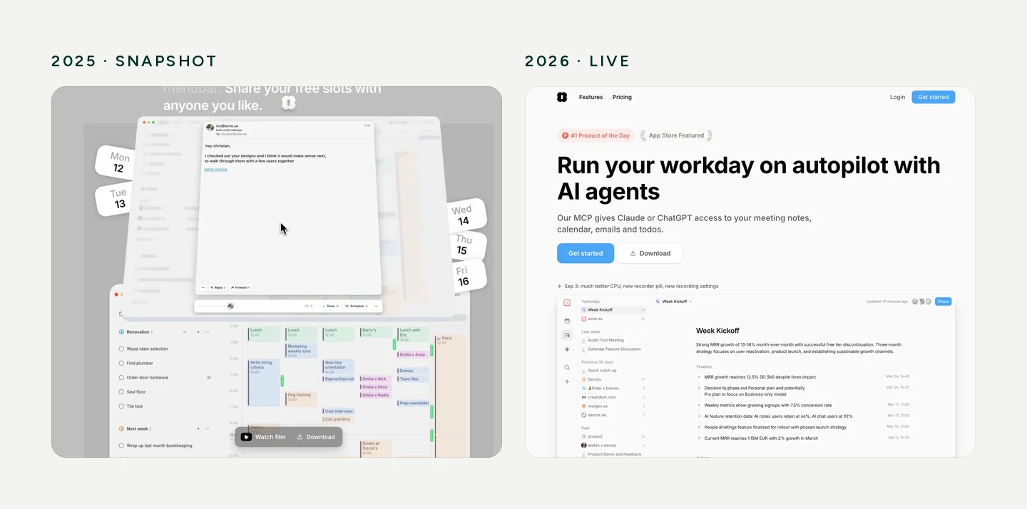
Some sites keep one style for years because they're a showcase. They already made one powerful element that's very hard for anyone to repeat, and the real conversations and sales happen offline, not through the website. There are few niches like this: mostly technical products and personal portfolios. Portfolios rarely change for another reason: they're hard to maintain and take time.
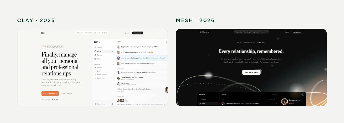
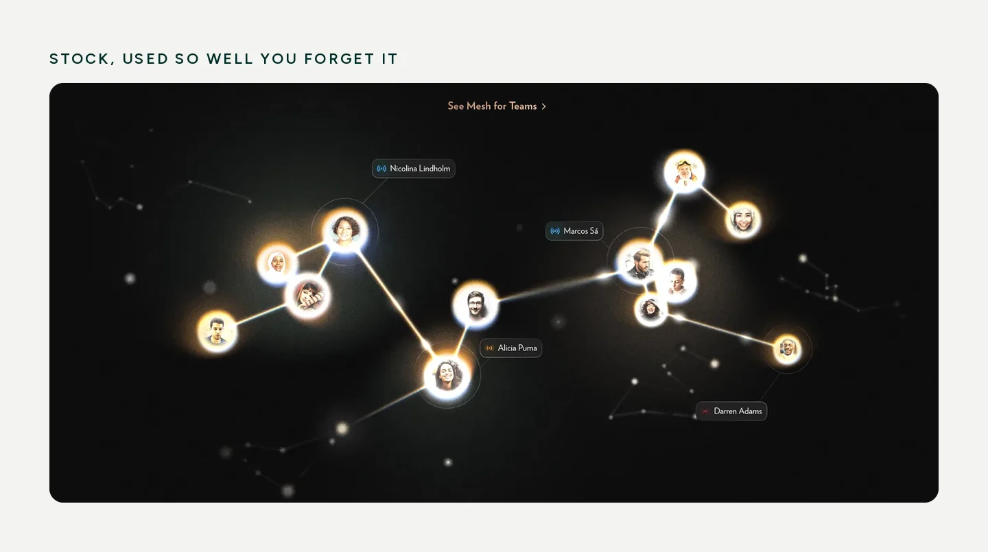
Layouts survive. UI animations will survive too, now that AI makes them fast to produce: anything quick and easy to make survives. Small, elegant animations, for example on cards, survive. Photography survives if you invested in a real photo base, because you can reuse it again and again. Generic stock graphics don't. But there are exceptions: Clay's rebrand uses stock so well that you forget it's stock.
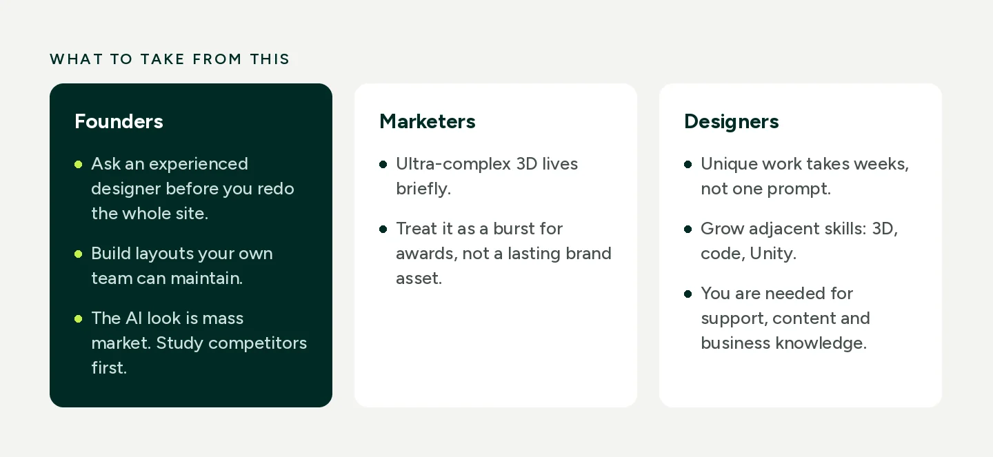
Founders. You need an experienced designer to tell you whether you really need to redo the whole site in a new style right now. Many teams spend too much time on the website instead of the product at the start. A good designer gives direction on layouts that are simple and maintainable, so your own team can build them. If you run a digital business, look at the market broadly and study your competitors. Up close, AI can look like a shortcut. Seen from above, the AI look is mass market, and it doesn't suit everyone.
Marketers. If you commission a unique, ultra-complex 3D solution, expect it to live briefly. It will most likely be a burst for awards rather than a lasting part of the brand.
Designers, especially juniors. Invest in uniqueness and pragmatism. Everyone will build sites with AI, but animating an AI-built site in an interesting way isn't one prompt. It takes weeks of testing and fixing on one element until you find something unique, and that part hasn't changed. Don't rush to redo every site someone generated: they don't need a designer yet, they're testing whether the product works. Designers are needed for support, consistent content, proofreading, ideas and knowledge of a specific business. Adjacent skills like 3D, code or Unity make you much faster. In this era you're limited only by your imagination.
No. I've been watching this for 11 years, and it has always worked this way. Expensive, complex decisions that take long to make usually lead nowhere. Products that try to save themselves through design never do. Uniqueness is for niches, and simplicity is better than most people think.
What is new is the problem AI creates: startup sites now look so alike that it's hard to tell which product is being advertised. Spend a little time looking at competitors and a little time on how to differentiate. Few people do it yet. Most rely on AI, and in a year, specialists will be growing their skills exactly where nobody else is looking.
Outcomes are my own judgement, made by comparing saved snapshots with the live sites in October 2026. The goal is to show a trend, not to rank anyone.
I share research, tools and design notes on LinkedIn.
Follow along to see the next one.